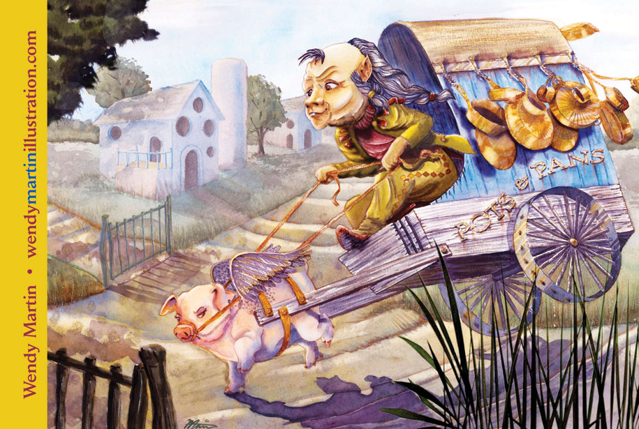
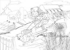
Back in October, when I was doing some cons, I took my sketch book along. In between customers, I drew this over-sized, mini dwarf guy. I was enamored with him and especially the cranky pig pulling the cart. I decided to finalize the idea as my first postcard project mailer for 2015.
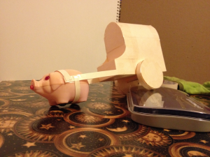
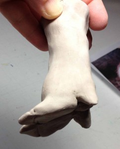
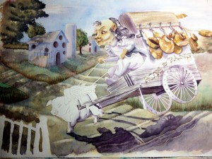
The original sketch, while charming, was lacking in both depth and story, so I redrew it to add more dimension and perspective. Lacking both a pig and a cart for reference, I made a cart out of a file folder, and a pig’s foot out of some clay. You know the kind, the actual dirt and mud type clay, not sculpty-type. I have about 8 pounds of the stuff. Now I had 3 dimensional reference.
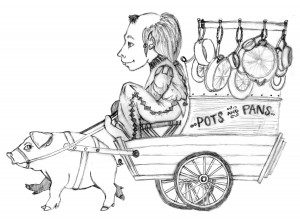
Once I had the reference, I took pictures of the resulting models, and came up a with a new sketch. I gave the both the dwarf and the pig more personality and added movement to the cart, pots and pans. The postcard project was in full swing.
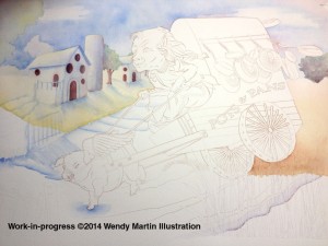
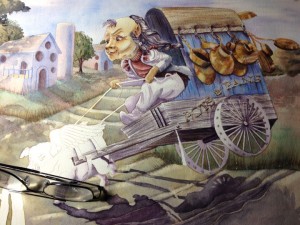
After a year or so struggling to get digital painting to look like traditional watercolor and being unsatisfied with the results, I decided to go back to my true love of transparent watercolors. However, I am still utilizing digital tools. One of the things I dreaded the most of the traditional art process was the laborious transfer of final sketch to watercolor paper. I have a huge light box. I used to tape my sketch to the glass and place the watercolor paper on top. I had to wait for full dark until I could trace the sketch on to the paper with pencil. It was a long, backbreaking and nit-picky process. Now, I use Adobe Illustrator to do my line work. Much easier to make adjustments and not have to worry about damaging the tooth of the watercolor paper. Once I am happy with the inking phase, I print it out on my large format printer right on the paper.
The painting process begins as soon as the printer ink has time to set. About 30 minutes seems to be optimum. Less time than that and it tends to run.
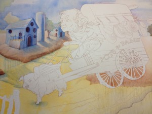
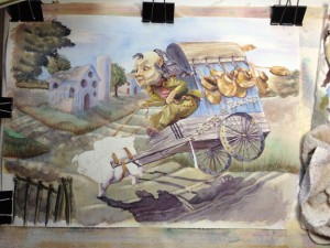
Adding color is the most fun part of the postcard project for me. I love watching my characters come to life. They do tend to take on a personality of their own as painting progresses.
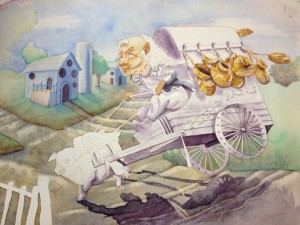
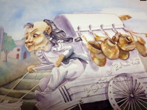
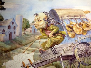
Once the traditional painting phase is complete, I scan the image back into the computer and do final retouching in Photoshop. You can see from the final image below, I adjusted values on the cart and the background, darkened areas of the dwarf and removed the cross-bar shadows under the cart. (They were distracting and confusing.)
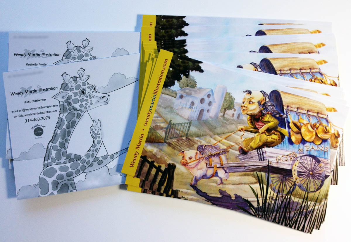
 For the postcard itself, I added my name and website in a band of yellow. The back of the card is black and white and included the rest of my contact information.
All the cards got mailed out this week. I feel good about getting a head start my quarterly postcard mailings. Maybe this year I will even hit my target goal of four mailings.
If you want to see the image at a larger size, please visit my fantasy art portfolio.
 RSS - Posts
Wendy,
Was this 140# CP Arches paper you printed it on? And what printer do you have that will do this?
I read that someone prints their sketch (via Kinko) onto Rives printmaking paper. What kind of paper will go through a printer?
For this image I used 140 CP Kilimanjaro Bright White. I have a Canon Pixma Pro9000 MarkII. It takes paper stock up to 14 inches wide. I’ve also printed directly on 300CP, but it tends to groove the paper at the sides.
Is your paper, 140 CP Kilimanjaro Bright White a smoother surface than the 140 CP Arches?
Would I be able to take a sketch and my Arches to some place like Kinko’s to have this done? Have you tried that? I can see that having a printer like this is great to have, but I’ll have to save my $$. It’s worth it, as I know about the ‘backbreaking’ hours of hand transfer. I sure have appreciated this post, and any more info you have to post about this will definitely be read by myself. I think this is so great, especially for the post card part of the business. Thanks again.
The surface is typical cold press. However, I find both the sizing and the quality of the paper to be higher than Arches, especially since I do a lot of scrubbing and lifting while painting. I find Arches to be “student grade” with the pricing to match. Kilimanjaro is pricey, but as a professional, it is well worth the expense.
As far as going to a Kinkos to have it done, all I can say is to try it.
The Pixma wasn’t that much higher in price than any other larger size format printer, and I also use it to print my archival art for sale in the smaller sizes. It’s an older model, so probably not readily available on the market. I’ve probably saved 3x what it would have cost in terms of additional printing costs since I bought it. Very happy with it. Only con for me is the small ink tanks are rather pricey and Canon doesn’t sell a waterproof option, although another manufacturer does.
Will have to check into printers more. Thanks.